Buttons
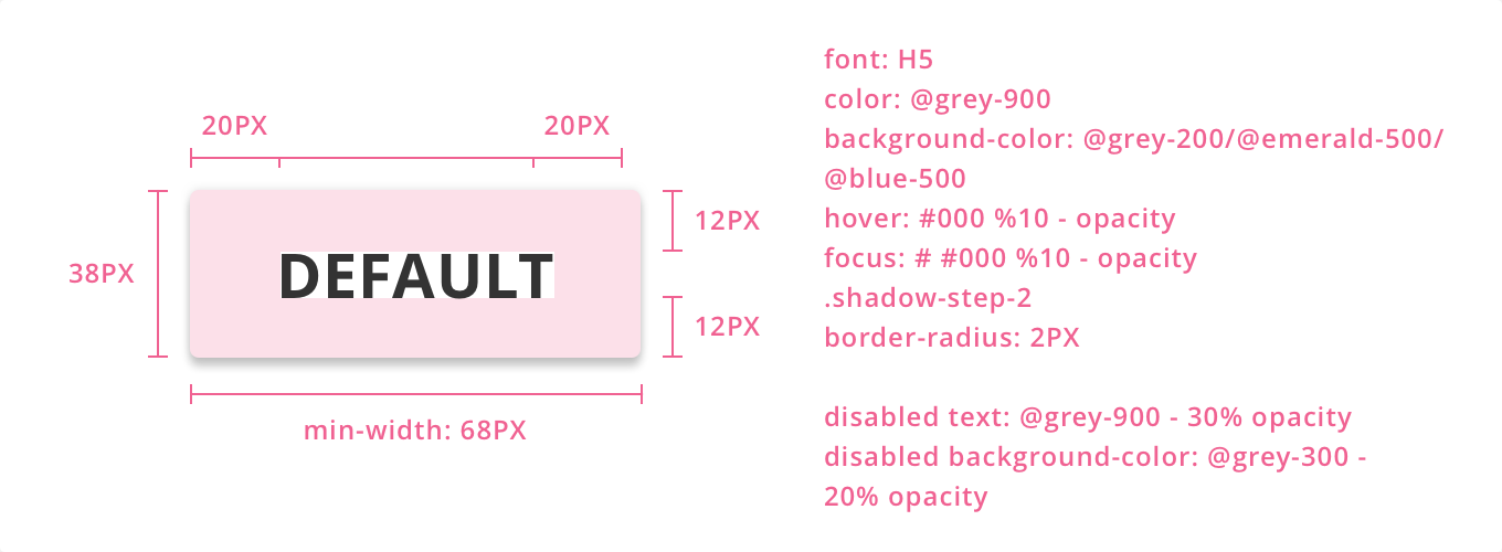
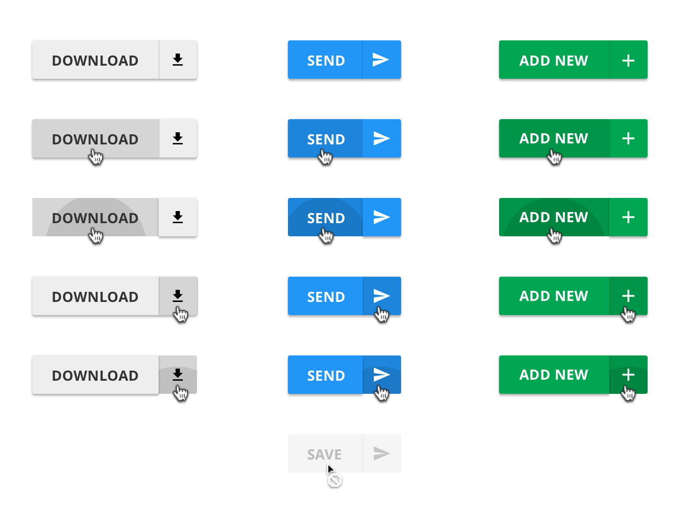
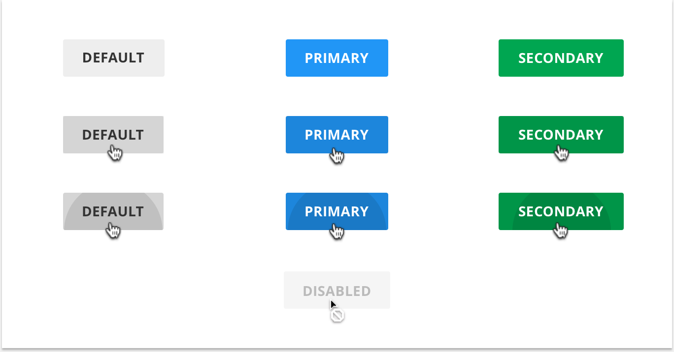
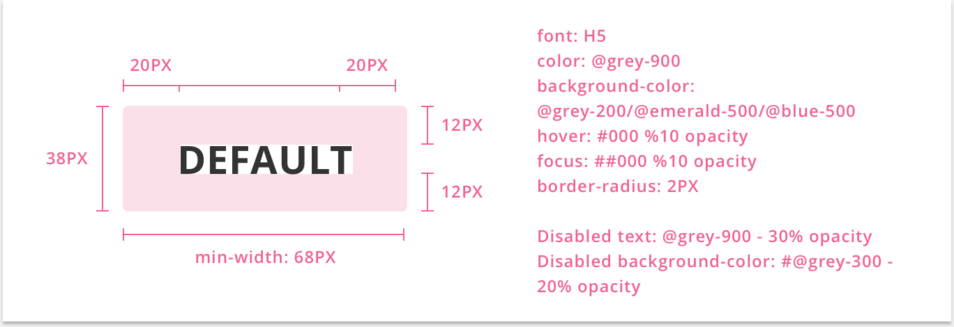
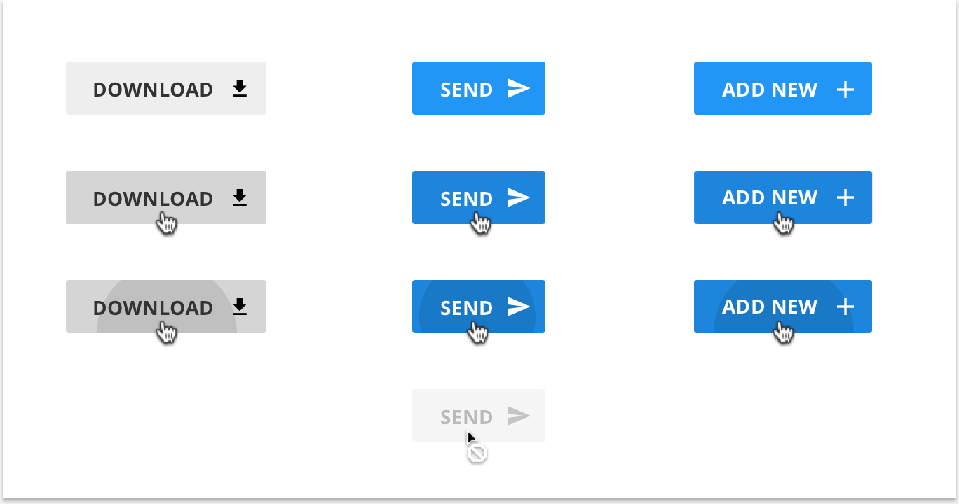
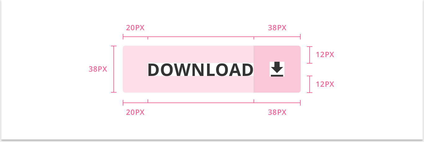
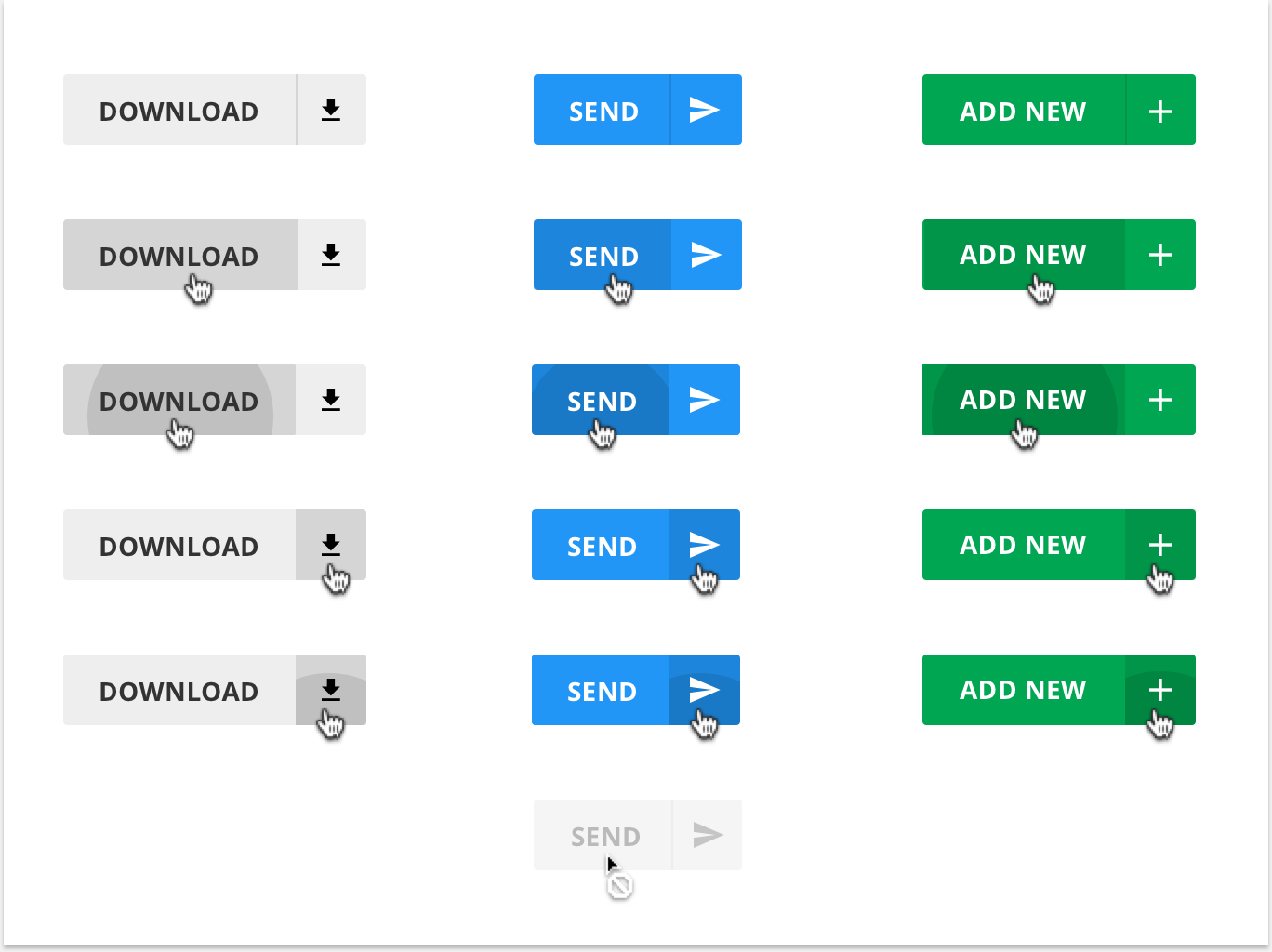
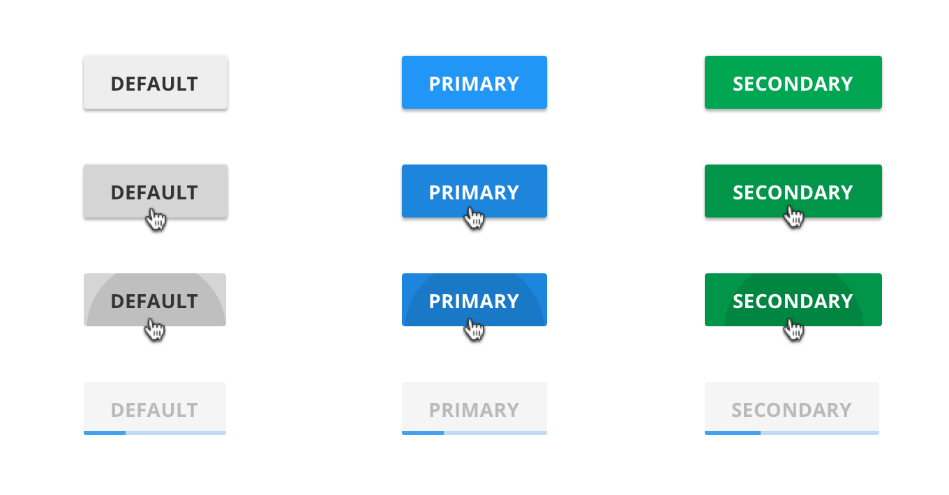
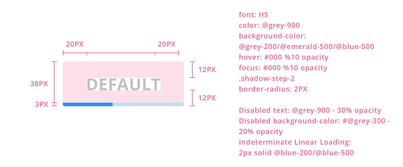
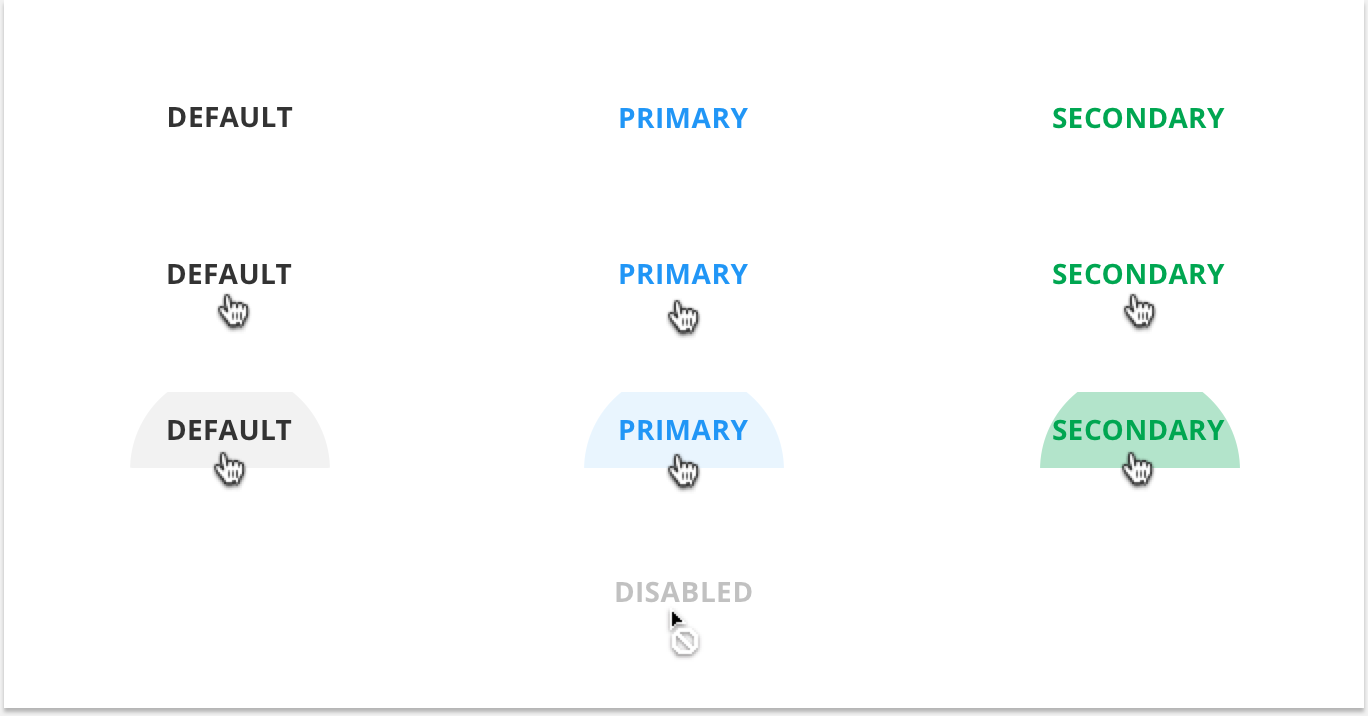
Buttons are used to clearly communicate an action or actions to a user. They can consist of text, an icon, or both depending on the type of action the button is conveying. Buttons come in various styles depending on the environment in which they live, as well as, the action in which they convey. For example, Raised Buttons exist on the canvas. Flat Buttons, on the other hand, live on surfaces that are already raised such as, cards, modals, or panels. A button's color is determined by it's context. A Primary Button will always be Emarald while a Secondary Button will always be Blue. Other buttons that are neither primary or secondary are defaulted to the Default Button Style - grey.
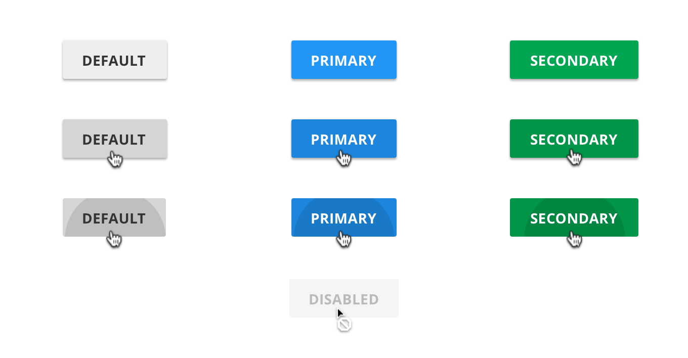
1. Raised Buttons
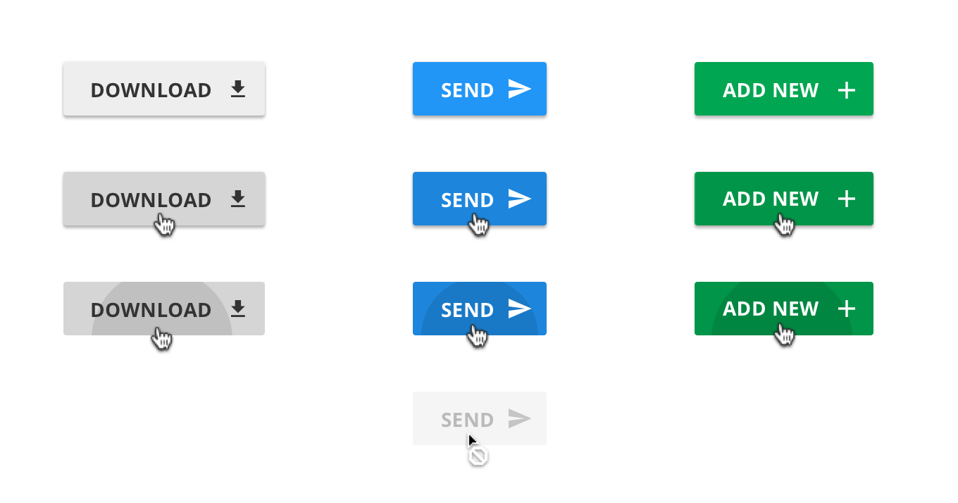
2. Raised Icon Buttons
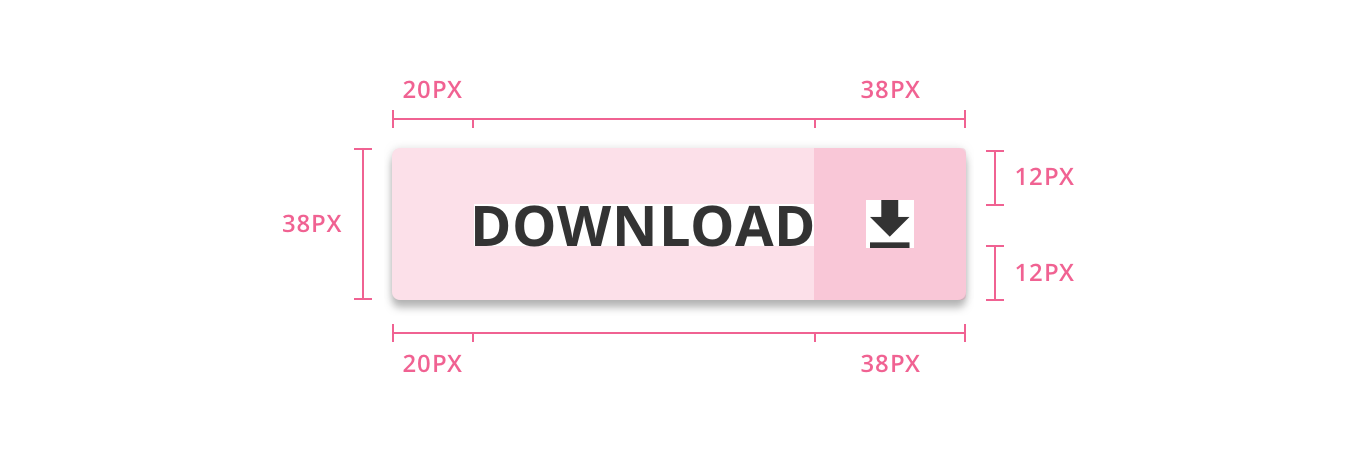
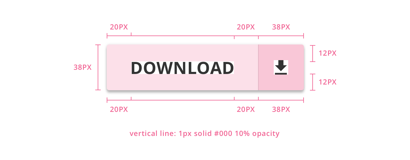
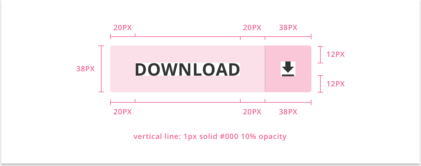
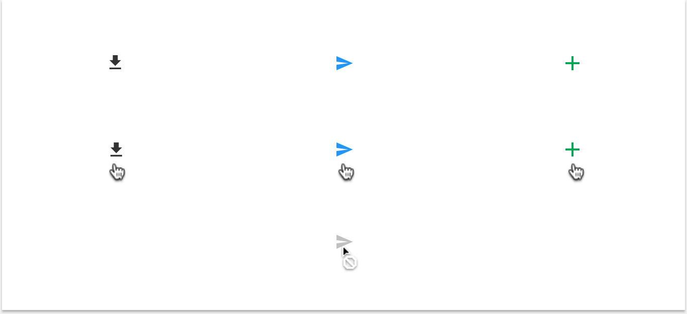
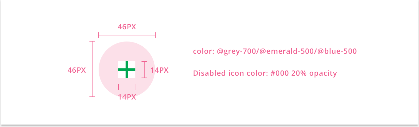
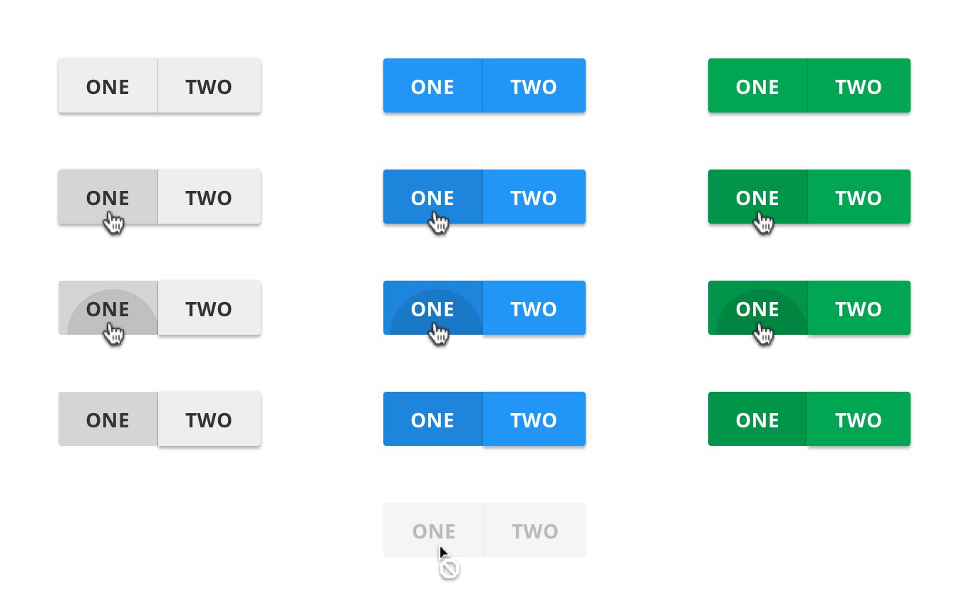
3. Split Raised Icon Buttons
4. Flat Buttons
5. Flat Icon Buttons
6. Split-Flat Icon Buttons
7. Icon Buttons
8. Loading Buttons
9. Split-Raised Toggle Buttons
10. Split-Flat Toggle Buttons
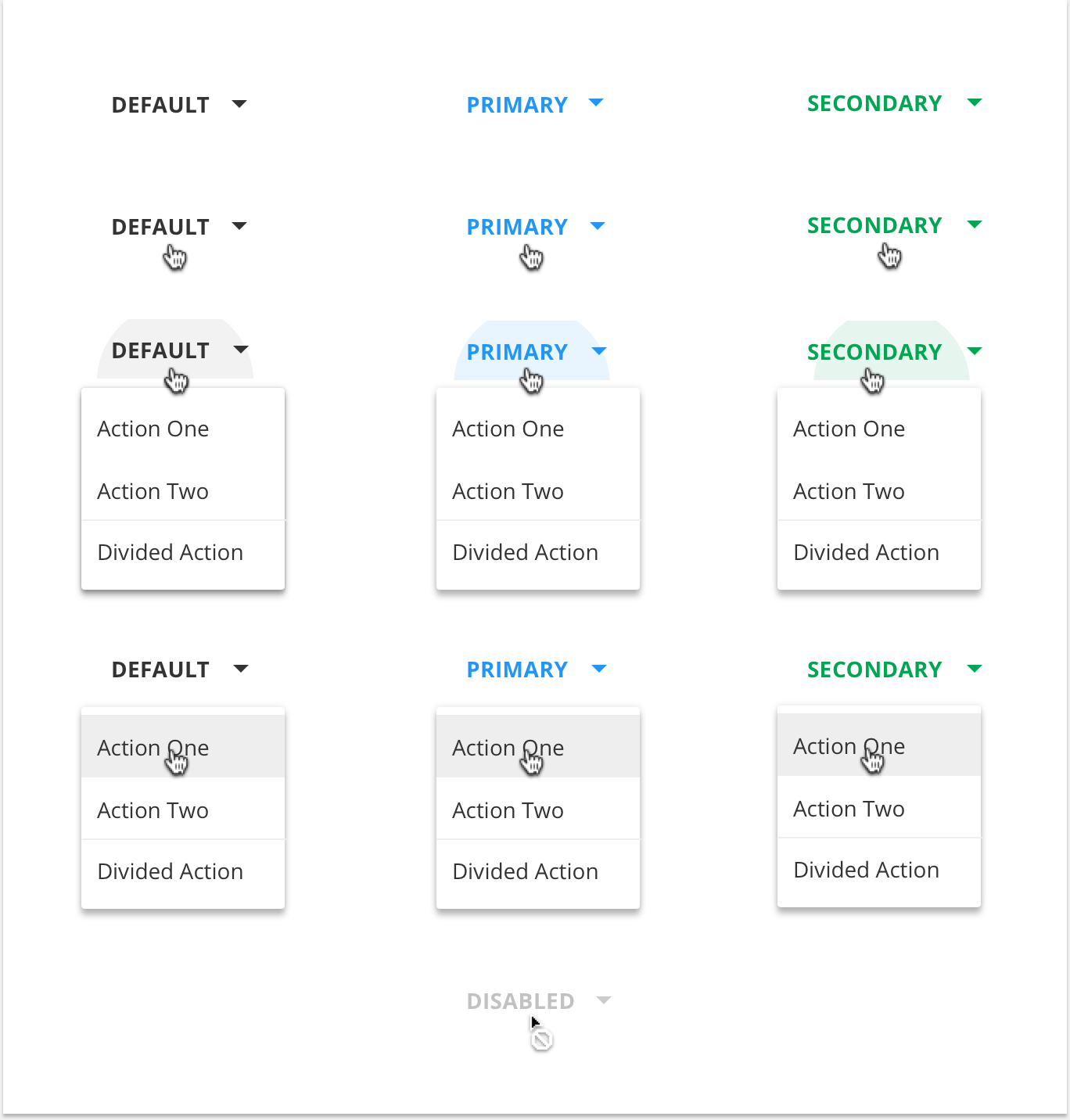
11. Raised Drop-Down Buttons
12. Flat Drop-Down Buttons
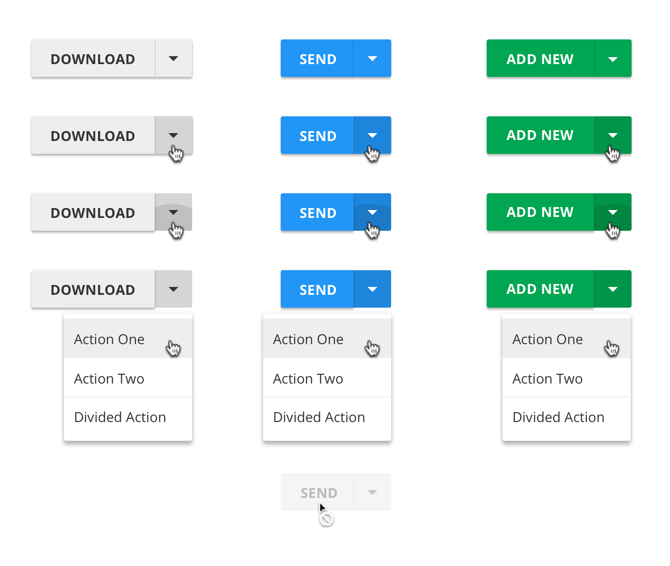
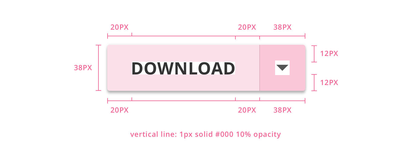
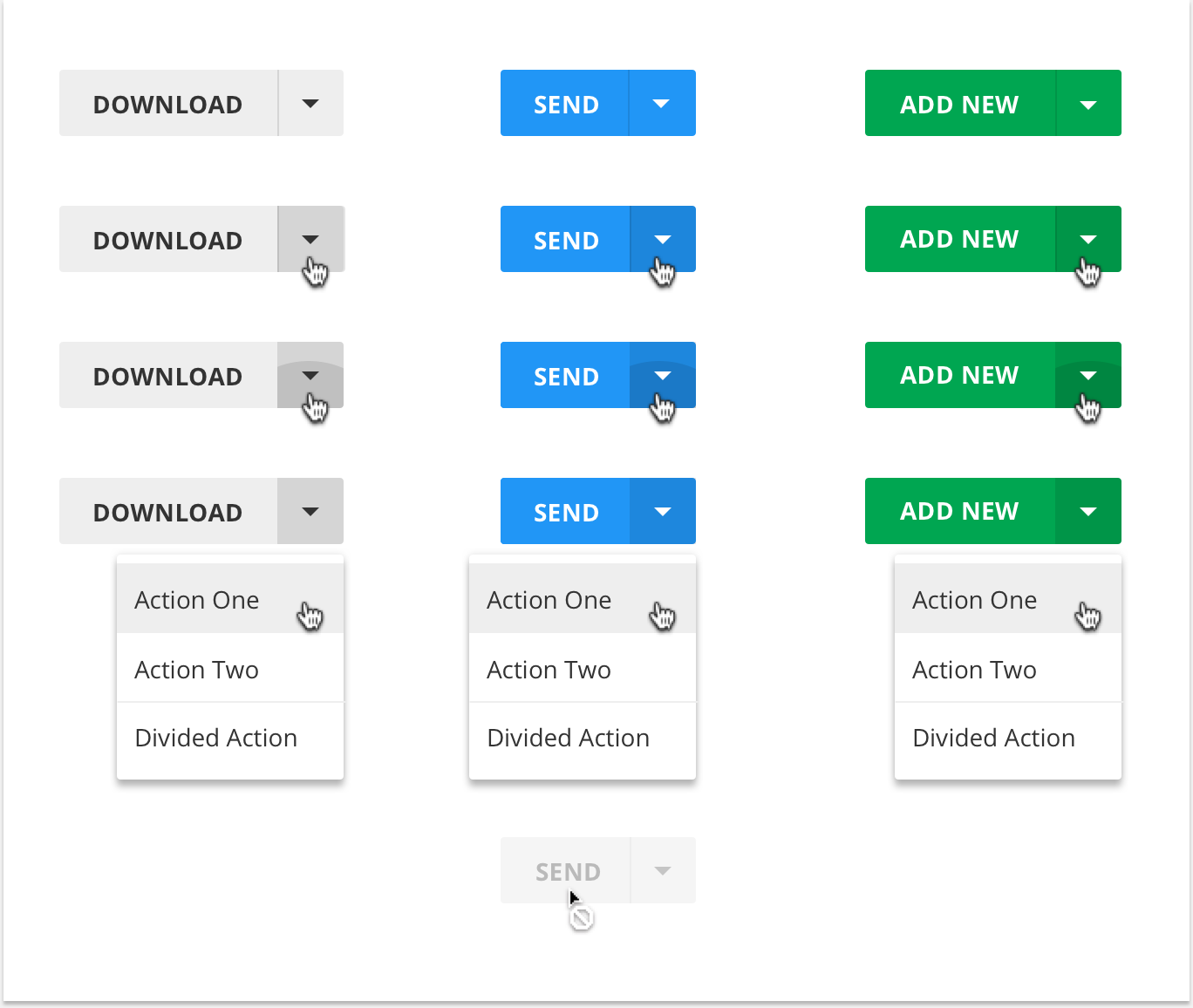
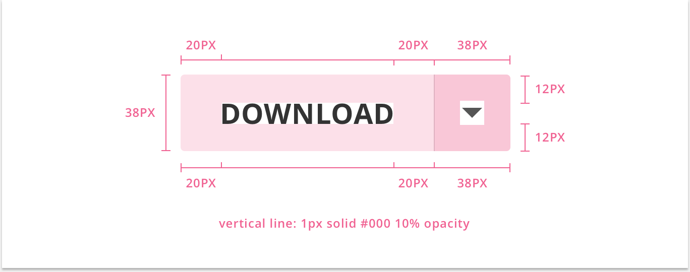
13. Split-Raised Drop-Down Buttons
14. Split-Flat Drop-Down Buttons
15. Ink Buttons
16. Ink Drop-Down Buttons