Grid System
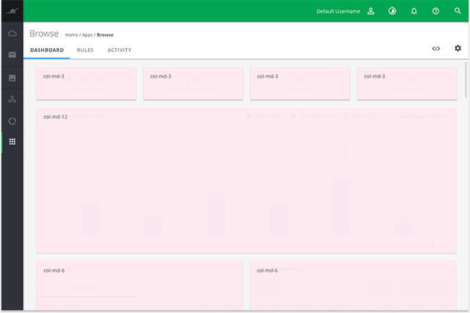
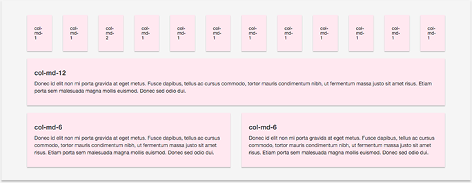
For our grid system we are leveraging the Bootstrap grid. This grid system includes a mobile first responsive fluid grid, that scales appropriately up to twelve columns as the device viewport size increases.
1. Example
![]()


2. In App Example
![]()

