Tooltips
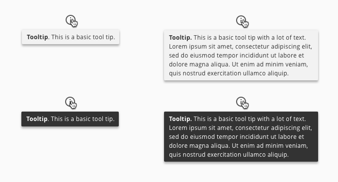
1. Basic Tooltips
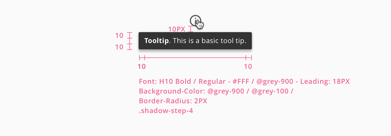
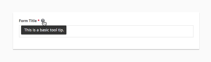
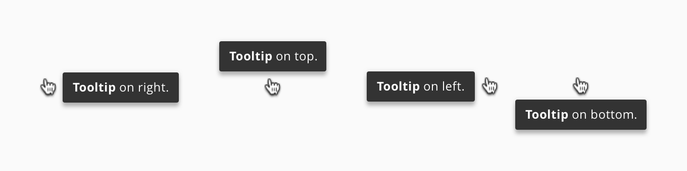
Tooltips are interactive elements that appear on hover and focus when a user either tabs to an element using the keyboard or when a user hovers over an element using the cursor. They help to explain the element that a user wants to know more about. Whether it be the specific name or action of an element or a more contextual helper explication. Tool-tips should always originate from the element that the user is hovering on.