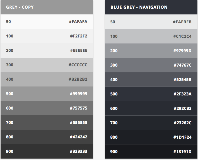
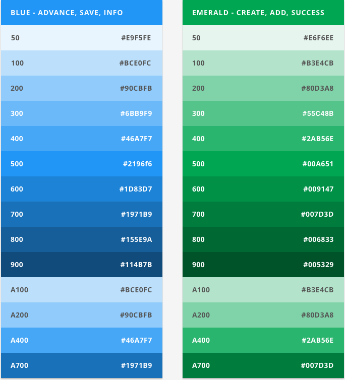
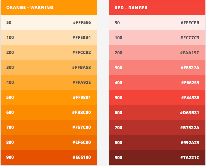
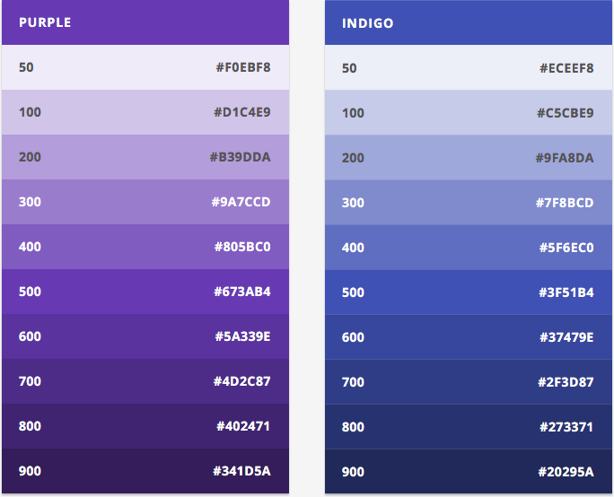
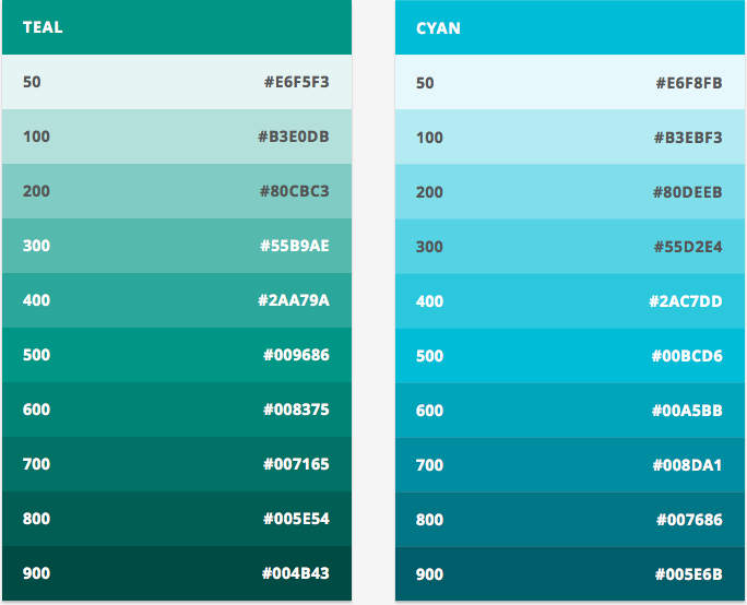
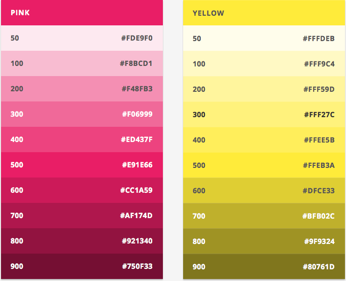
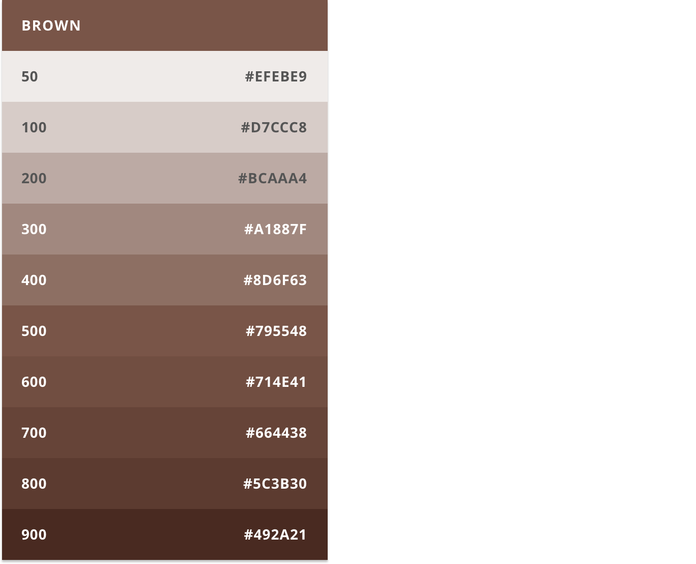
Color
This color palette includes primary and accent colors that can be used for graphs, illlustrations, and other elements. They have been carefully crafted and hand-picked to work in harmony with each other, as well as, with Bronto’s brand.
Blue, emerald, and grey are the foundation colors for the User Interface. These colors are used for key elements such as buttons, headers, and text. Orange and red are primarily used to communicate to the user, but can also be used as data visualization highlights on graphs and charts.